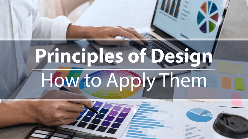
12 Principles of Design & How to works
Last updated on March 25th, 2023 by A1 True Jobs
You can’t just flip a switch and create beautiful designs on a whim. Like learning to walk before you run, there are certain fundamentals you’ve got to learn first.
The problem is that if you don’t have the time or inclination to take a design course, resources are pretty scarce. Sure you can rely on Canva templates, but even then you need to know how to use them properly.
This is why we've put together this post. It’s for you if you’ve ever wondered what goes into good design. You'll find it handy whether you're a complete amateur or a budding designer—so let's get stuck in.
What are design principles?
Design principles are guidelines to follow if you want to create effective visuals, from oil paintings and blog graphics to eye-catching social media posts.
Think of design as carpentry and these principles as your toolbox. You can use them to help you during the design process, and unlike hammers, nails and screwdrivers, they can exist entirely inside your head.
These tools give you a better understanding—and appreciation—of what goes into the designs we see every day. As you become acquainted with them, you’ll start to see what does and doesn’t work (and why), as well as how you can apply these principles to your own creative work.
What is "good design"?
We’re told that piece of art is subjective. For the most part, that’s true. But if you’ve ever seen an unintelligible parking sign or a website from the early days of the web, you’ll know there’s definitely such a thing as bad design.
As Jared Spool, an expert on design and usability, says, “good design, when it’s done well, becomes invisible. It’s only when it’s done poorly that we notice it.” This is why good design is tricky to define.
Luckily for us, in the late 1970s, an influential designer named Dieter Rams saw this problem. In response, he asked himself what constituted good design and came up with his own list of ten principles.
Little did he know, they would go on to inspire generations of designers, including Johnny Ive, the mastermind behind Apple’s most famous products.
Rams’s principles are:
- Good design is innovative
- Good design makes a product useful
- Good design is aesthetic
- Good design makes a product understandable
- Good design is unobtrusive
- Good design is honest
- Good design is long-lasting
- Good design is thorough down to the last detail
- Good design is environmentally friendly
- Good design is as little design as possible
You might notice that these principles are aimed at product design. Rams worked at Braun, so products were in his wheelhouse, but these principles are easily adapted to UX, UI, or any other design context.
Rams’s principles aren’t the only principles out there. Other notable design principles include Nielsen’s 10 usability heuristics and Whitney Hess’s five guiding principles for experienced designers.
The 12 principles of design
These are the building blocks graphic designers and artists use to put creative works together; the core principles of art that make up every design, from the fine art of the Louvre to the boxes of Corn Flakes at the local grocery store.
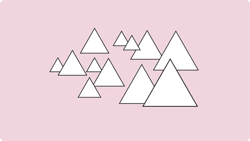
1. Balance
Where objects in real life carry physical weight, elements in design carry visual weight. Large elements are heavier and small elements lighter, with each element having its own "weight" based on how much attention they draw.
Visual balance is about ensuring your design is equally weighted on both sides of the central point. It’s like a seesaw—too much weight on either side and the whole thing becomes unbalanced.
By striking this balance you create visual harmony and stop your design from feeling too chaotic to the viewer. It’s one of the most important parts of visual composition, and comes in three basic forms:
Symmetrical balance
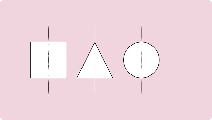
Symmetrical design uses an imaginary vertical (or sometimes horizontal) line to divide a design into two halves around a central point. Elements of equal visual weight are balanced on each side of the axis to create symmetry.
There are two variants of symmetrical balance: Reflectional symmetry, where the two halves are exact mirror images, and translational symmetry, where the same shape or elements are repeated on both sides of the design.
Asymmetrical balance
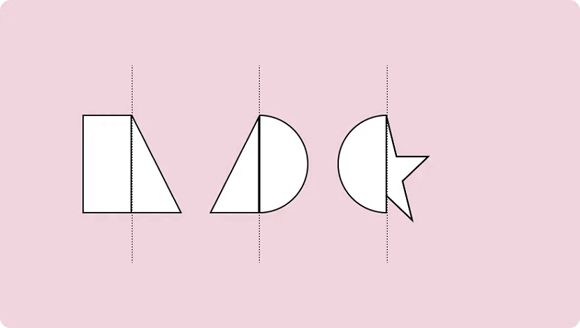
An asymmetric composition is when a design uses unequal weighted elements. One side might have a visually heavy element, balanced with multiple lighter elements on the opposite side.
To run with the seesaw example, it would be like having a 100kg weight on one side and 100 kg of feathers stacked on the other. It still achieves balance but provides a whole different experience.
Asymmetry is often more visually interesting. Where symmetrical designs can be quite static and predictable, asymmetrical balance can give designs a more dynamic feel.
Radial balance
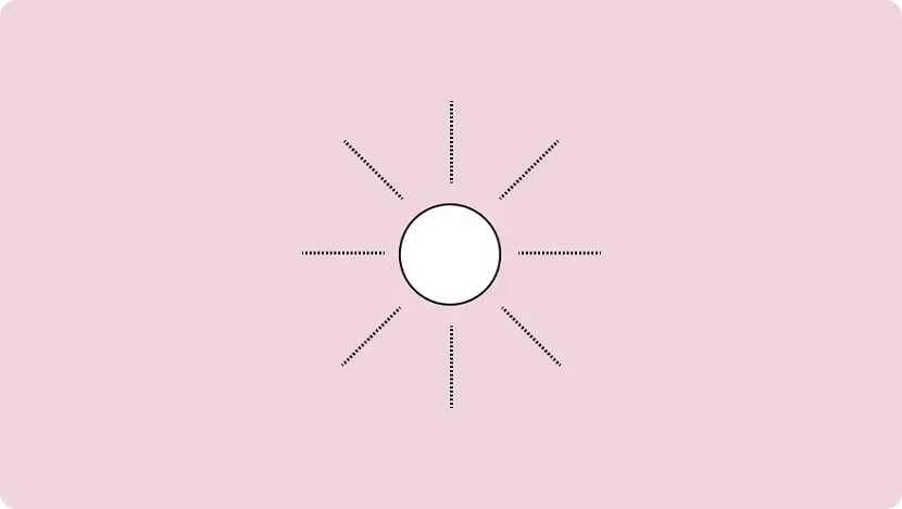
Radial balance is when elements “radiate” from a point in the centre of a design. Think of rays shining from the sun, petals blossoming from a rose, or a squirt of tomato sauce in the middle of a juicy meat pie.
This form of symmetry is a way to add depth and movement to a design and works to draw attention to an object in the centre of a composition.
2. Emphasis
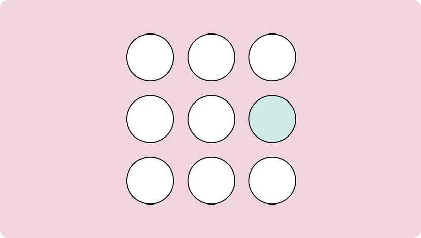
Emphasis is used to focus the viewer’s attention on a certain part of a composition. The effect is achieved by manipulating elements (like colour, shape and size) to make specific parts of a design stand out.
For example, say you wanted to bring attention to a call to action on a landing page. You could increase the text size and use colours that stand out from the background, emphasising the CTA and making sure visitors can’t miss it.
3. Repetition
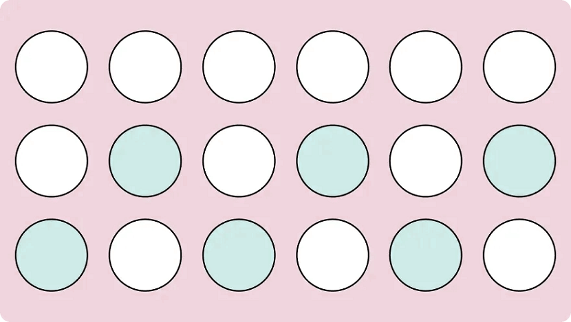
As you may have already guessed, repetition refers to when an element is repeated throughout a design. It could be anything, from using a certain font colour to adding a repetitive pattern to a social media post.
Repetition makes designs visually exciting and cohesive. It also creates a sense of consistency by using a repeating motif that the viewer comes to expect. This makes it particularly useful when it comes to creating your distinct brand identity.
Brand identity is the visible element of your brand. The colours; design; logo. It acts to distinguish your company from the millions of others out there, so when folks see your designs they immediately know it’s your business.
Every successful business uses repetition. Why do we equate the swoosh and “just do it” with Nike? The blue can with Pepsi? Because these visuals were repeated so often that eventually they became synonymous with the brands they represent.
So while repetition can just help you make a sweet iPhone wallpaper, it’s a crucial tool for any company looking to build a visual identity and brand recognition.
4. Movement
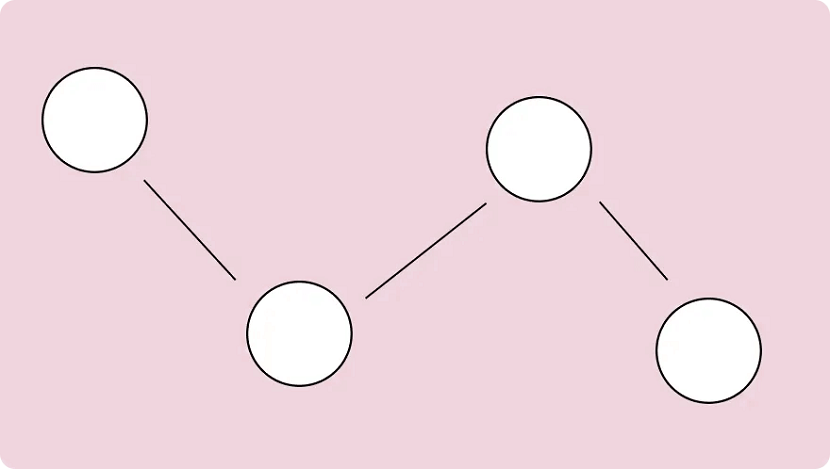
When we think of movement we think of, well, things moving. A pendulum swinging. A Ferrari roaring down the freeway. But in design, it refers to the path a viewer’s eye takes when they look over a composition.
It’s not just what you look at; it’s the way you look at it. Designers can guide this by using lines, edges, shapes and colours to create focal points and encourage certain ways of seeing.
Movement can be harnessed to distract, direct and pull the viewer’s gaze around a design. By using subtle cues (particularly with lighting and perspective) a savvy artist can control this entire process. You can use lines to create directional cues and make images feel more alive.
5. Proportion
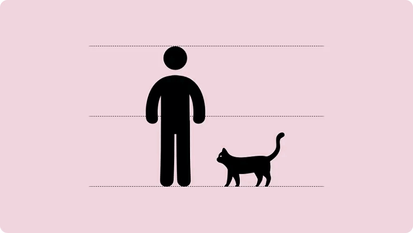
Proportion is the relationship between two or more elements in a design, particularly the size and scale of them. When things are "proportionate”, it means there’s a coordination between them that makes the design look aesthetically pleasing.
For example, when you’re reading a blog post you expect headings to be larger than the body text. Or if you were looking at a realistic drawing of a tortoise and a hare, you expect the hare to be larger than the tortoise.
Proportion is about finding harmony between two elements. You want to make sure things look “right”— that the elements look as if they belong together.
This is something that comes up when creating digital assets and websites online. It’s the bane of many an amateur designer’s existence. Here are a few tips for keeping the elements in your design in proportion:
- Assemble elements that are identical or share a function.
- Establish major and minor areas in the design to prevent monotony and boredom.
- Ensure size variations are subtle (unless the objective is emphasis.) Avoid separating the composition into halves, quarters, and thirds. Try to keep a sense of balance.
You can also play with proportions in a variety of ways to emphasise elements or get a certain message across. It’s a strategy you’ll notice advertisements do often and is usually best used for more creative projects.
6. White Space
\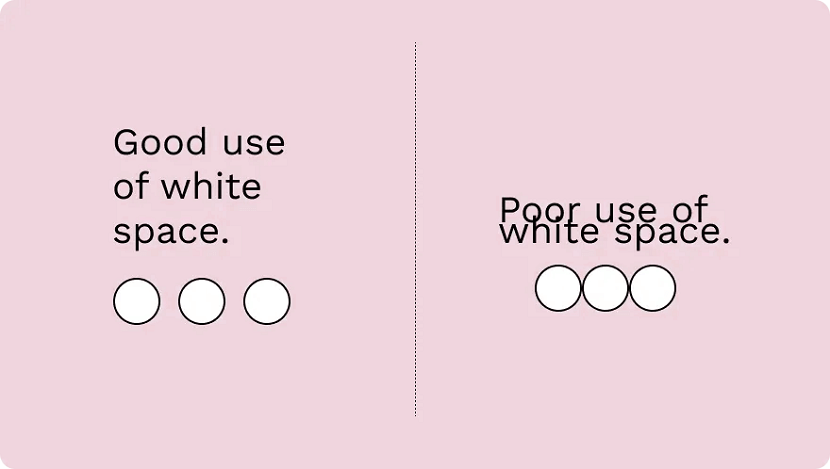
The region between different design elements is referred to as "negative” or “white” space. This is part of the design that doesn’t contain anything. No images, drawings, shiny colours or text. Nothing.
The name is kind of misleading — it’s not a "negative" thing and it doesn’t have to be "white". It can be any colour: white space refers to what you don’t add; the empty parts around and within your design.
It’s one of the fundamental building blocks of design and is just as important as any elements you do include. Think of it like a diet: what you eat matters, but what you don’t eat matters just as much.
“White Space in design composition is the same as the use of silence in a musical composition. Without proportionate use of silence, music is unstructured. Similarly, without white space, design is unstructured and difficult to consume." — Mark den Hartog
There are two types of white space: micro and macro. Micro white space is the space between small elements (like text), while macro white space refers to the area between large elements or surrounding a design.
7. Contrast
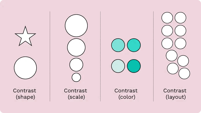
Contrast is produced when two or more visual elements in a composition are different. It can be used to create specific effects, emphasise the significance of certain elements, and add visual appeal to your designs.
Designs that look the same are boring—by experimenting with contrasting colour hues, shapes, sizes, textures and typography, you can liven things up. Humans tend to like contrast. It’s a great way to grab attention, control the visual flow and keep folks engaged.
Keep in mind that adding too many variations can be confusing for viewers (the opposite effect you want to have.) As with most of the different elements of art, it’s about striking a balance.
8. Hierarchy
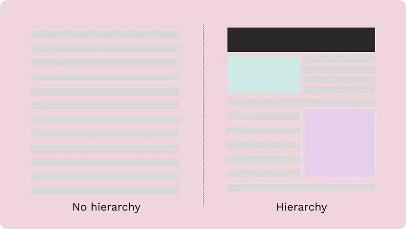
Visual hierarchy is about organising the value of the elements within your design. By ranking information from most important to least important, you make it easier for the viewer to digest your content.
This plays a critical role in UI and UX design. Ever noticed how most landing pages have the same layout? There’s a logo at the top, a menu at the top and then elements in descending order of importance below.
It’s not because they copied each other's homework—there’s a certain hierarchy that designers stick to in order to draw attention to the right things in the right order (and make it pretty to look at.)
The viewer’s eye should be drawn to the most important element first. These sit atop the throne at the top of the hierarchy, with the elements laid out below ranked in order of importance.
There are a number of visual tricks to influence this flow, including:
- Size and scale: The larger an element is the more likely a viewer is to see it. By making something smaller you can reduce its importance and put the emphasis elsewhere.
- Colour and contrast: A splash of colour makes a big difference. Use bright colours to make certain elements or information pop.
- Fonts: Use different typefaces and stylisations like italics and bold to draw the eye and move text higher or lower on the hierarchy.
- White space: White space enables you to give an element breathing room and make a central element stand out.
Patterns of hierarchy
People read a page in the same way: from top to bottom. But we don’t just stare blankly at s page and wait for information to register, we scan it.
The human eye tends to follow the same path during this process. For that reason, designers stick to two common patterns to make it faster to absorb information: the F-pattern and the Z-pattern.
The F-pattern applies to pages made up mostly of text, like an online or printed article. Readers scan in the shape of an “F”—first, with the headline across the top, then down the left side of the page and to the right as they identify things they find interesting.
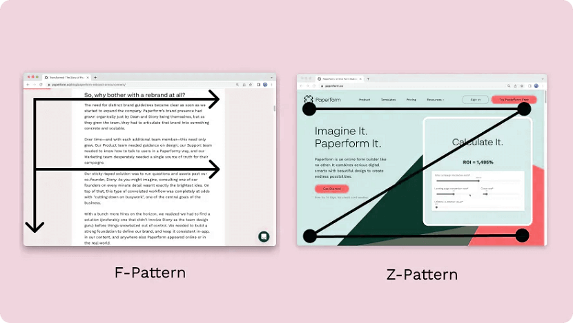
Designers use a Z-pattern for layouts with less text and more visuals. With this pattern, viewers scan across the top of the page and then diagonally down towards the opposite corner. They then scan the bottom in the same way as the top.
Most websites are designed in this way (including Paperform). Notice how the most important parts like the logo and navigation menu are at the top, while the secondary information like clients and chatbot is at the bottom.
9. Rhythm
Don’t worry, you can leave your dancing shoes at home. In design, rhythm hasn’t got anything to do with the way you move your hips. It’s about giving your composition a feeling of action and movement.
Designers create rhythm by repeating lines, shapes, colours and other elements. This makes a path for our eyes to follow, builds patterns and imbues the design with a sense of flow. There are a few different types of rhythm:
- Random rhythm: Repeating elements without any regular interval.
- Regular rhythm: When the elements are of a similar size and length and spread out over predictable intervals.
- Flowing rhythm: Natural patterns where the intervals are organic (like a tiger’s stripes or a bunch of flowers in a garden.)
- Progressive rhythm: A gradual change or sequence of elements that change over a series of clear steps (like a colour gradient for example.)
Rather than letting the viewer’s eye settle on a focal point, rhythm encourages viewers to move their eyes across the entire piece, following the lines and forms to their natural endpoints. It’s something you see reflected across nature and works of art.
10. Pattern
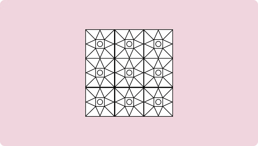
People tend to get confused between repetition in patterns, which is understandable, as they both deal with repeated elements. But the similarities end there.
While repetition occurs when the same elements are repeated throughout a design, a pattern is composed of different components repeated in the same way. Think of the way gift wrapping is usually made up of a few different repeated elements—that's a pattern.
You'll also notice patterns commonly used as backgrounds on websites and in mobile applications.
As a general rule, it's best to use colours, textures and shapes to create patterns. Try to avoid doing so with words — it tends to just give folks headaches. Despite the occasional bright colours and wacky designs, the key to creating effective patterns is simplicity.
11. Variety
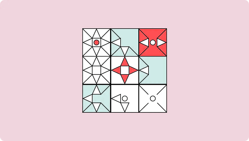
Variety isn’t just the spice of life—it’s the spice of design too. It’s integral not to revert to the same old elements within a design to make sure things are visually interesting for your viewers.
Variety keeps things engaging. It stops designs from being stagnant, predictable and downright boring — all things you want to avoid. By making sure elements are varied you stop designs from feeling monotonous and uninspired.
The easiest way to do this is through juxtaposition and contrast. Place bright colours next to lighter hues, text next to images, and round shapes next to square ones. By doing so you can keep viewers engaged and your design interesting.
12. Unity
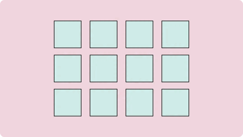
We've put unity last on this list for a reason—it only occurs when all the various elements within a design coexist to form a holistic experience that’s pleasing to the eye.
Unity adds order and makes a piece feel like a coherent whole, instead of a messy combination of individual parts that just so happen to exist on the same page. It's developed both visually and conceptually.
- Visual unity. An extension of “harmony”, is about elements working together, like colour schemes, the use of complementary styles, and in some cases, the repetition of colours and elements to achieve consistency. An example would be using the same colours for all the buttons on a webpage to keep the design cohesive.
- Conceptual unity. Is when you combine elements for the user’s convenience; it’s about blending form and function in a natural way. An example of this is how you can double-tap on Instagram to “Like” an image—it reduces friction and requires less action from the user.
To achieve unity you need to look out for three things: whether the elements you’ve used have a good reason to be there, whether they work together, and whether the message or concept you’re trying to display is communicated clearly.
By making sure your designs unite you reduce cognitive load and ensure viewers actually understand whatever it is your design is trying to achieve.
Put these design principles to work
Hopefully, these 12 design principles can help inspire you to take your creative work to the next level.
No matter what you’re designing—from product pages to actual products—if you take the time to learn and apply these concepts you’ll be firmly set on the path to success.
Remember, design is always evolving. Look at what other people are doing and think about how you can apply their techniques to your own work: it’s a great way to hone your design skills.
Now, all that’s left is to put your creative cap on and create your own work of art. Happy creating!
Disclaimer : The original content is 12 Principles of Design & How to works and owner ( RGB Web Tech ) reserved rights for content

WRITTEN BY
A1 True Jobs
Explore our blog in Career Advice, Resumes & Cover Letters, Stress Management, Jobs and Careers, Career Development categories.